Professional Education @Berkeley Engineering

Professional Education @Berkeley Engineering

A conversion-optimized online course platform for UC Berkeley’s College of Engineering

| Web UX Design

| SEO & Marketing Integration

Time

Time

2025, 6 weeks

Status

Launched

Status

Launched

My Contribution

My Contribution

UX/UI Design

Visual Design

Developer Support

Collaborated w/

Collaborated w/

CMO/PM x 1

Developer x 1

Visual Designer x 1

Overview

Overview

I was the sole UX designer for a new website promoting professional education courses at UC Berkeley’s College of Engineering, housed under the Sutardja Center for Entrepreneurship and Technology (SCET). This is a conversion-optimized online course platform designed to elevate brand identity, promote custom education offerings, and drive enrollment through strategic UX and content design.

KEY METRICS

KEY METRICS

+46%

+46%

organic traffic

organic traffic

driven by the SEO-optimized blog structure and strategic content layout.

driven by the SEO-optimized blog structure and strategic content layout.

x 2.1

x 2.1

longer average time on site

longer average time on site

and a noticeable drop in bounce rate, reflecting improved navigation flow and user engagement.

and a noticeable drop in bounce rate, reflecting improved navigation flow and user engagement.

+73%

+73%

course page conversion rate

course page conversion rate

with more visitors submitting lead forms to access course brochures after key messaging and CTA redesign.

with more visitors submitting lead forms to access course brochures after key messaging and CTA redesign.

+23%

+23%

click-through rate

click-through rate

on primary CTAs such as “Contact Us” and “Get Brochure”, indicating stronger intent and clearer action pathways.

on primary CTAs such as “Contact Us” and “Get Brochure”, indicating stronger intent and clearer action pathways.

So…how did I get here?

So…how did I get here?

THE CHALLENGE

THE CHALLENGE

Modernize the experience and drive conversions

Modernize the experience and drive conversions

↑ Old pages


The previous course pages were buried in SCET’s main site and lacked clarity, professionalism, and marketing impact.


The new standalone platform needed to:

  1. Deliver a modern,

    elegant user experience

  1. Deliver a modern,

    elegant user experience

  1. Promote both regular and custom course offerings

  1. Integrate with SCET’s marketing strategy to convert visitors into leads and paying customers

RESEARCH & INSIGHTS

RESEARCH & INSIGHTS

Where are the critical drop-off points and what conversion opportunities are there?

Where are the critical drop-off points and what conversion opportunities are there?

  1. Top-performing platforms prioritize clarity, trust, and lead capture at every scroll

    To guide the redesign, I started by conducting a competitive analysis of top-performing online course platforms (e.g., Harvard, MIT, Maven) to benchmark content structure, visual tone, and conversion strategies. I identified a consistent content structure that drives conversion:

  1. Top-performing platforms prioritize clarity, trust, and lead capture at every scroll


    To guide the redesign, I started by conducting a competitive analysis of top-performing online course platforms (e.g., Harvard, MIT, Maven) to benchmark content structure, visual tone, and conversion strategies. I identified a consistent content structure that drives conversion:

  • Hero sections with clear value props and a single CTA

  • Immediate access to lead forms (e.g., “Get Your Brochure”)

  • Content structured for scanning: short blocks, bold headings, visual testimonials

  • Gated content and webinars as lead-gen tools

  • Persistent CTAs via floating navs or anchored buttons

  • Trust signals such as certificates, instructor profiles, and success metrics

  1. Empathy mapping revealed hesitation points and guided targeted UX interventions

    Tracing user emotions and doubts at each step made it easier to pinpoint emotional friction, such as:

  1. Empathy mapping revealed hesitation points and guided targeted UX interventions


    Tracing user emotions and doubts at each step made it easier to pinpoint emotional friction, such as:


  • Choice overload at the homepage

  • Unclear value exchange on course pages

  • Insecurity around enrollment and data sharing


  • Choice overload at the homepage

  • Unclear value exchange on course pages

  • Insecurity around enrollment and data sharing


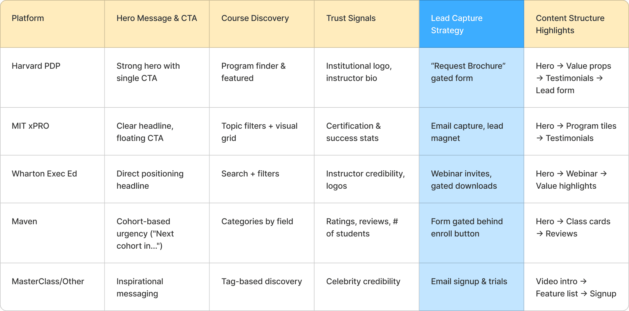
Visualizing quotes and reactions helped align the team around user needs and inspired solutions like simplified filtering, trust signals, and gated content with clear next steps. This approach also made stakeholder communication more effective—quickly showing why changes were needed, not just what to change.

DESIGN HIGHLIGHTS

DESIGN HIGHLIGHTS

Turning a complex offering into a clear, conversion-focused experience

Turning a complex offering into a clear, conversion-focused experience

  1. A complete design system:
    I built a scalable brand library including color, typography, icons, UI components, and photo strategy tailored to a professional audience.

  1. A complete design system:
    I built a scalable brand library including color, typography, icons, UI components, and photo strategy tailored to a professional audience.

  1. Redesigned course discovery experience:
    I structured course offerings to reduce friction, highlight value, and guide users through a clear path from interest to enrollment

  1. Redesigned course discovery experience:
    I structured course offerings to reduce friction, highlight value, and guide users through a clear path from interest to enrollment

  1. Optimized for lead generation:
    I integrated strategic CTAs, gated downloads (e.g., brochures), and resource content designed to capture emails and optimize SEO.

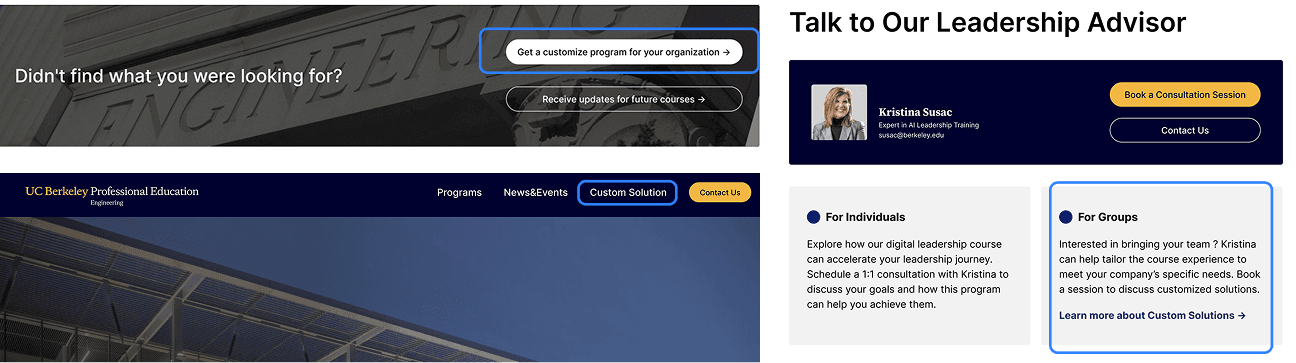
  1. Increased visibility of custom solutions
    Designed cross-site placements and content blocks to elevate bespoke offerings as a key value proposition.

  1. Built trust through credibility markers
    I highlighted featured instructors, SCET’s institutional backing, and testimonials to reinforce expertise and quality.

Full Prototype

TAKEAWAYS

TAKEAWAYS

Designing with both user empathy and business impact in mind

This project deepened my confidence in designing end-to-end digital experiences that are not only usable and beautiful, but also measurable and strategically effective. I learned how to:

Align UX design with the full marketing funnel—from traffic acquisition (via SEO and content) to conversion (via gated CTAs and trust signals)

Align UX design with the full marketing funnel—from traffic acquisition (via SEO and content) to conversion (via gated CTAs and trust signals)

Communicate value clearly and early through concise layouts, visual hierarchy, and messaging

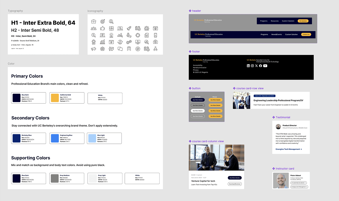
Create a scalable, consistent design system that could support future content expansion and marketing experiments

TOP

KATHERINE LIU

©2025

KATHERINE LIU

©2025